

ui / ux • Jan 2018
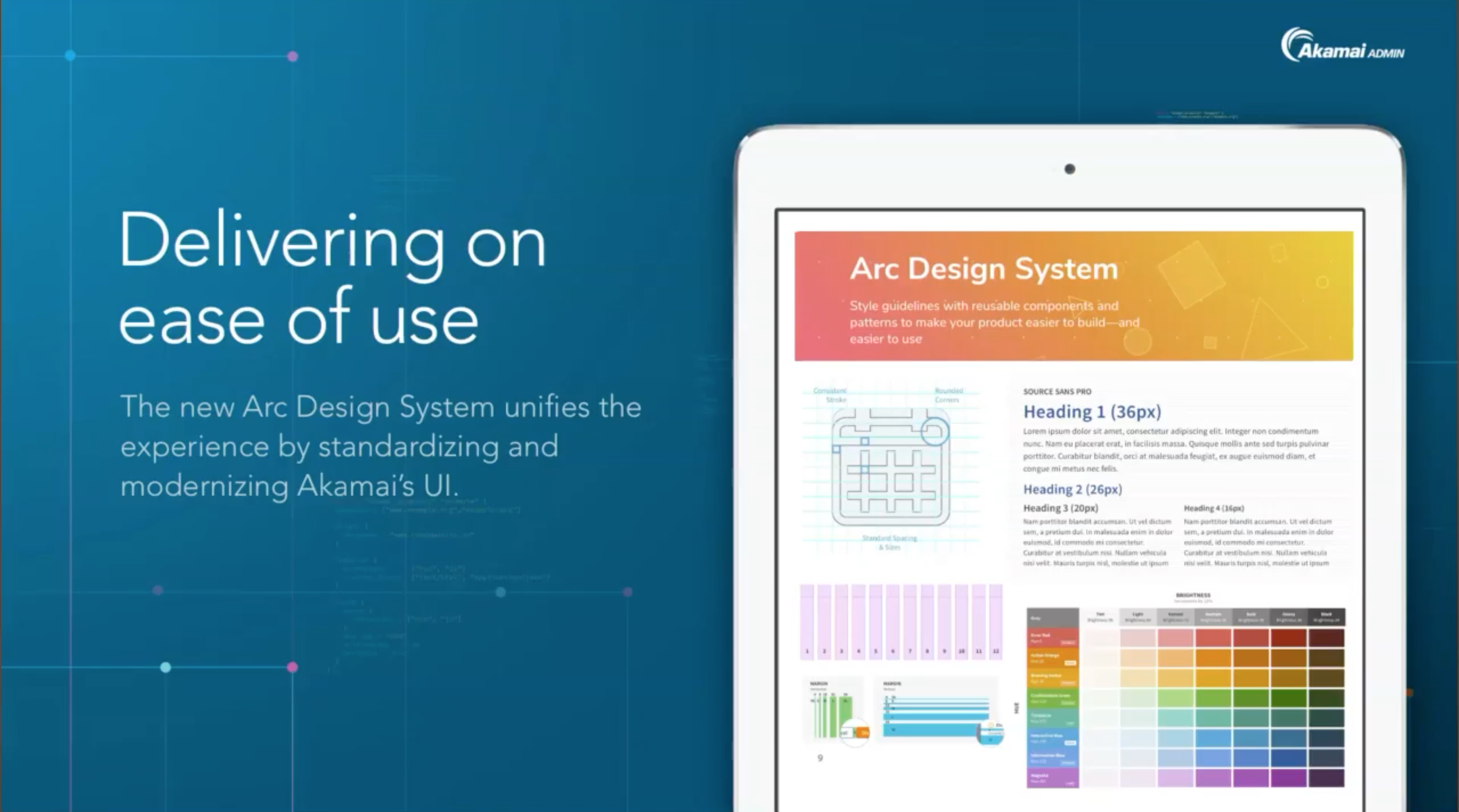
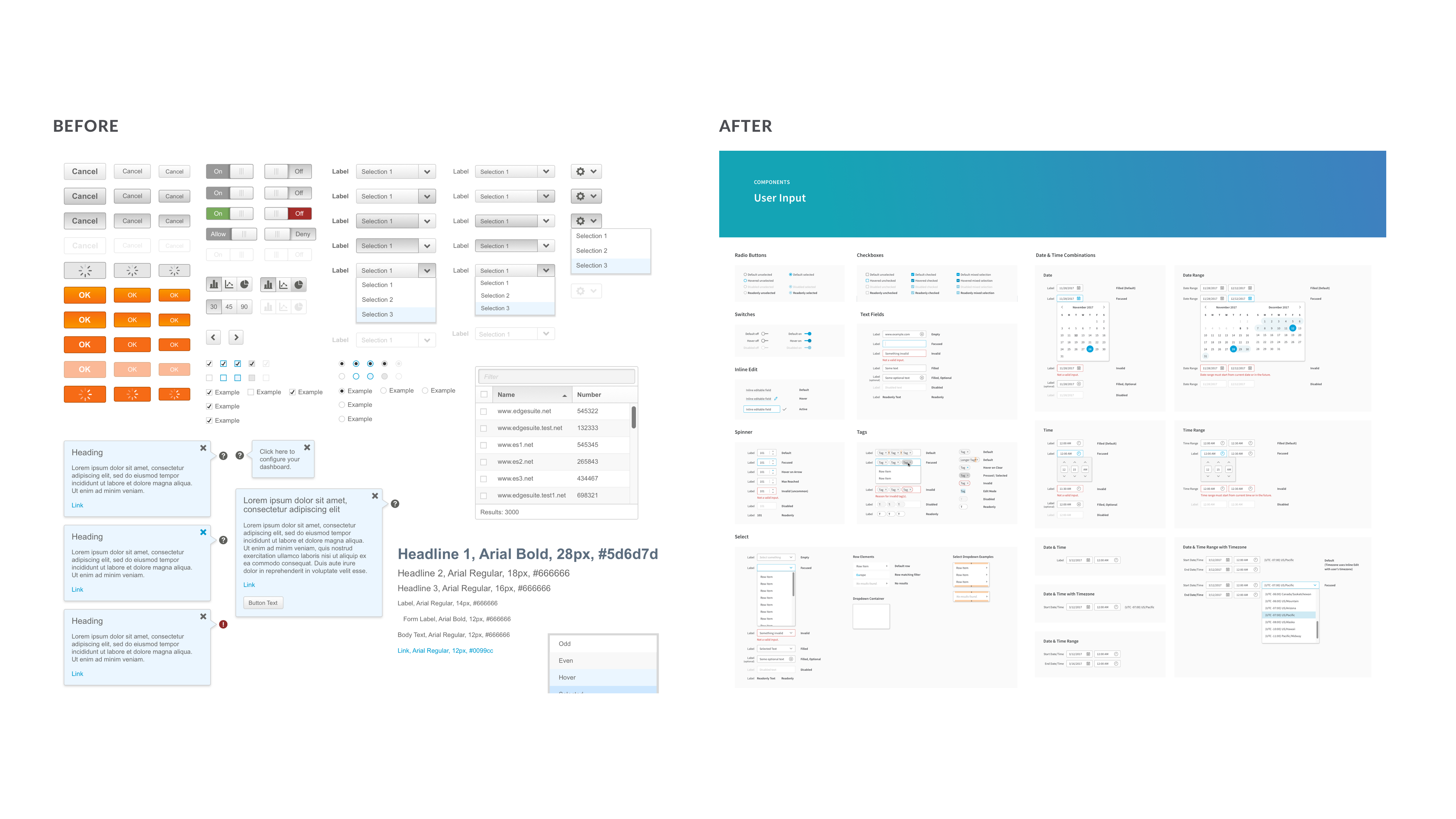
Akamai Technologies is the global leader in Content Delivery Network (CDN) services, making the Internet fast, reliable and secure for its customers. In 2012, Akamai launched a redesigned web portal to help users configure settings and monitor assets relating to their Akamai services. However, throughout its years of evolution, the portal began to have more and more issues with consistency and was in need of a visual refresh.
Our three main challenges were:
1. Redesign the portal with a modern look & feel while also providing familiarity to our users
2. Build individual components and focus on a consistent experience throughout the portal
3. Work with a limited amount of time and resource to generate cross-company adoption
In order to best tackle those challenges, we decided to create a new design system to help us work faster.
The target users for this design system were Akamai designers, developers, product managers, and people involved in the development of new products within Akamai. Our main audience was the end-user, Akamai’s paying customer.
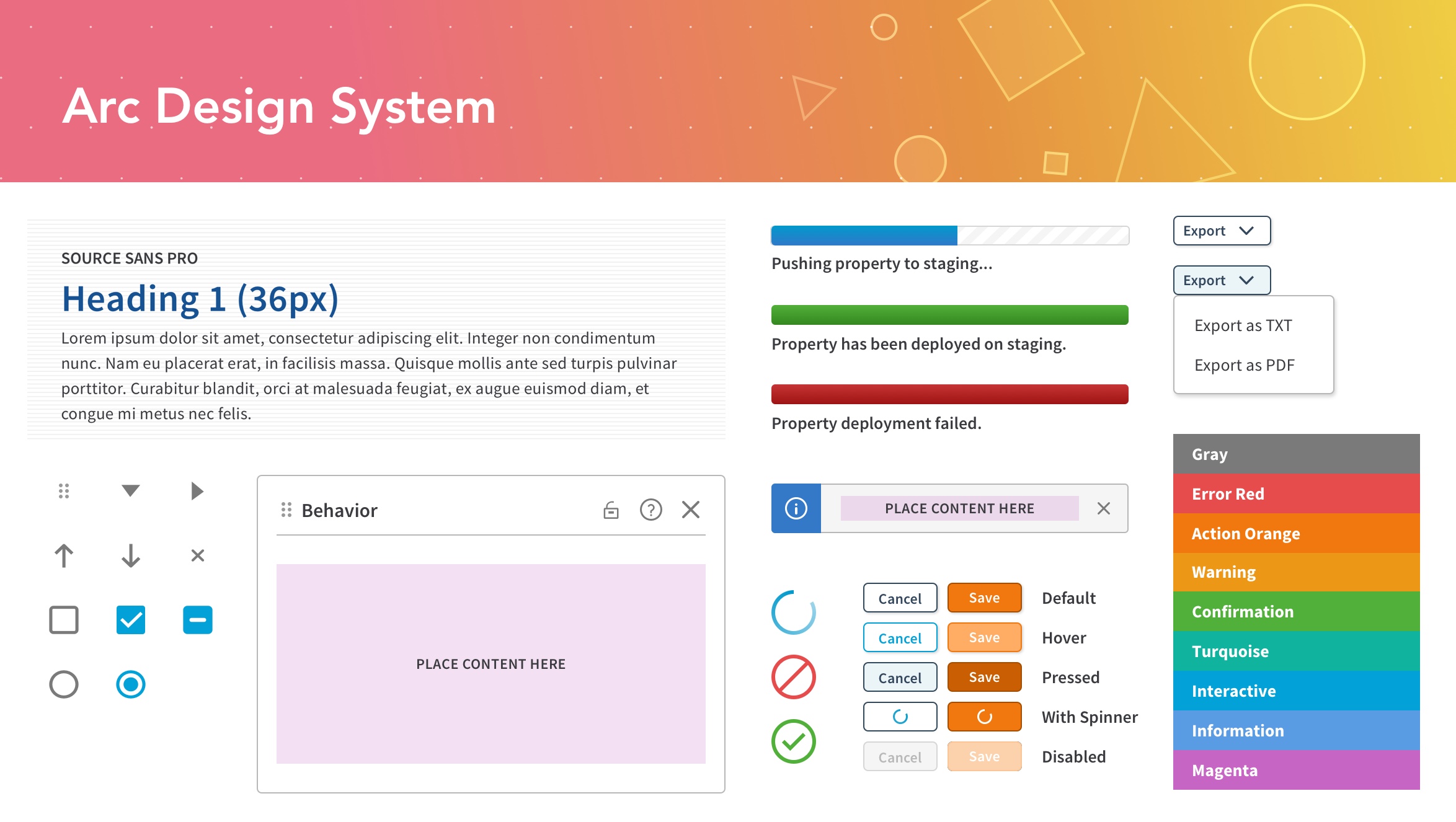
I brought together a small group of designers to overhaul a new modern design system during the concept phase. I tasked myself with defining foundational style guidelines (typography, iconography, color, grids) for Akamai's new design system.
Our team worked closely with the front-end engineering team during implementation to design and build the revamped UI components.
Vision
We setup a war room to helped us gather information and align direction. Our small team created assets like moodboards and style tiles, audited Akamai's visual assets, and brought in multiple product teams to understand and synthesize everyones needs.
Tooling
We standardized on using Sketch as a common design tool to allow us to share work from the wireframes to full mockups. I also helped streamline our team's workflow by introducing and training other designers on reusable symbols, UI component library, and version control with Sketch, Invision Craft and Abstract.
Creating
While attention to detail is important, quickly showing progress and potential was critical for management to provide us with more resources. We started with smaller milestones to help our team build confidence with this project and help validate the benefits of a design system to the upper management.
With the release and adoption of the design system within our company, our team is now focuses on maintaining the design system and its documentation site to help other designers and partners within the company to learn and use the new design system.