graphic / product •
MEDIUM
Transparent paper on coptic-bound book
DIMENSIONS
7.5'' x 5'' x 2.5''
21 Words | 21 Works is a collection of work made in Rebeca Méndez's "Word + Image" class. Each student was responsible for 20 pages of print content based on a "deconstructing/generating" process taught in class. The process involved reading through different publications in Graphic Design: Now in Production, narrowing down to one article, extracting 10 sentences, 20 words, 10 words, 5 words and eventually to one word. That one word was then explored throughout 4 weeks before concepts were generated about the word.
After I narrowed down to the word wall, I pitched 3 concepts that were inspired by it:
1. Metaphysical walls: What is actually stopping you from doing something?
2. Border of thought: How does your background affect your experience?
3. Dare to become limitless: How would you change your biggest regret?
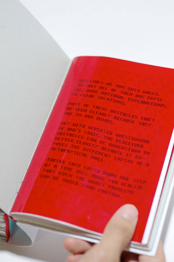
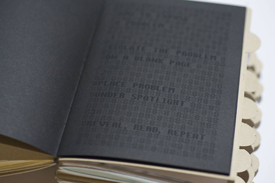
I selected idea #1 because I was personally running into some obstacles in my life and I couldn't identify why. Through the process of this research, I learned about the problem-solving technique called 5 Whys that helps with root cause analysis. By uncovering multiple layers of cause and effect, I was able to surface the most relevant issues and resolve my issue by targeting the root cause. That experience made me decide to incorporate this methodology into the project.
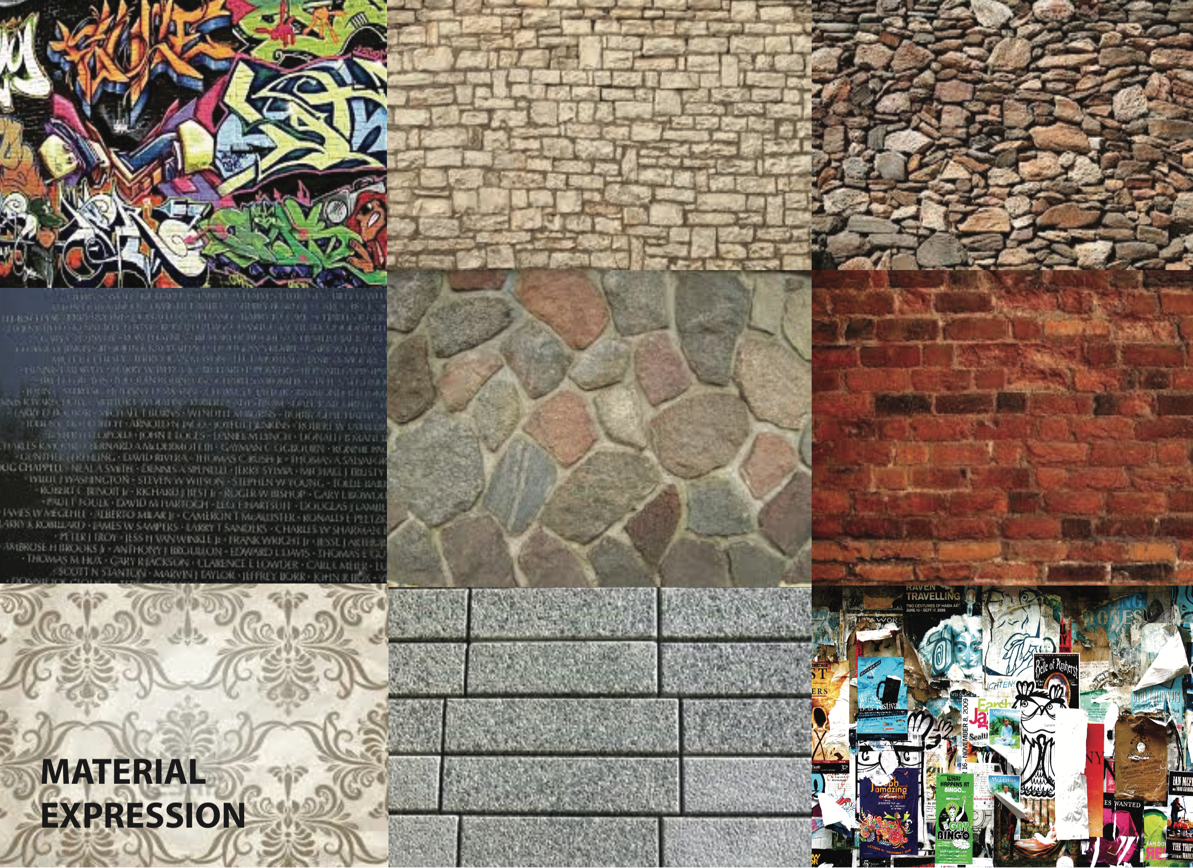
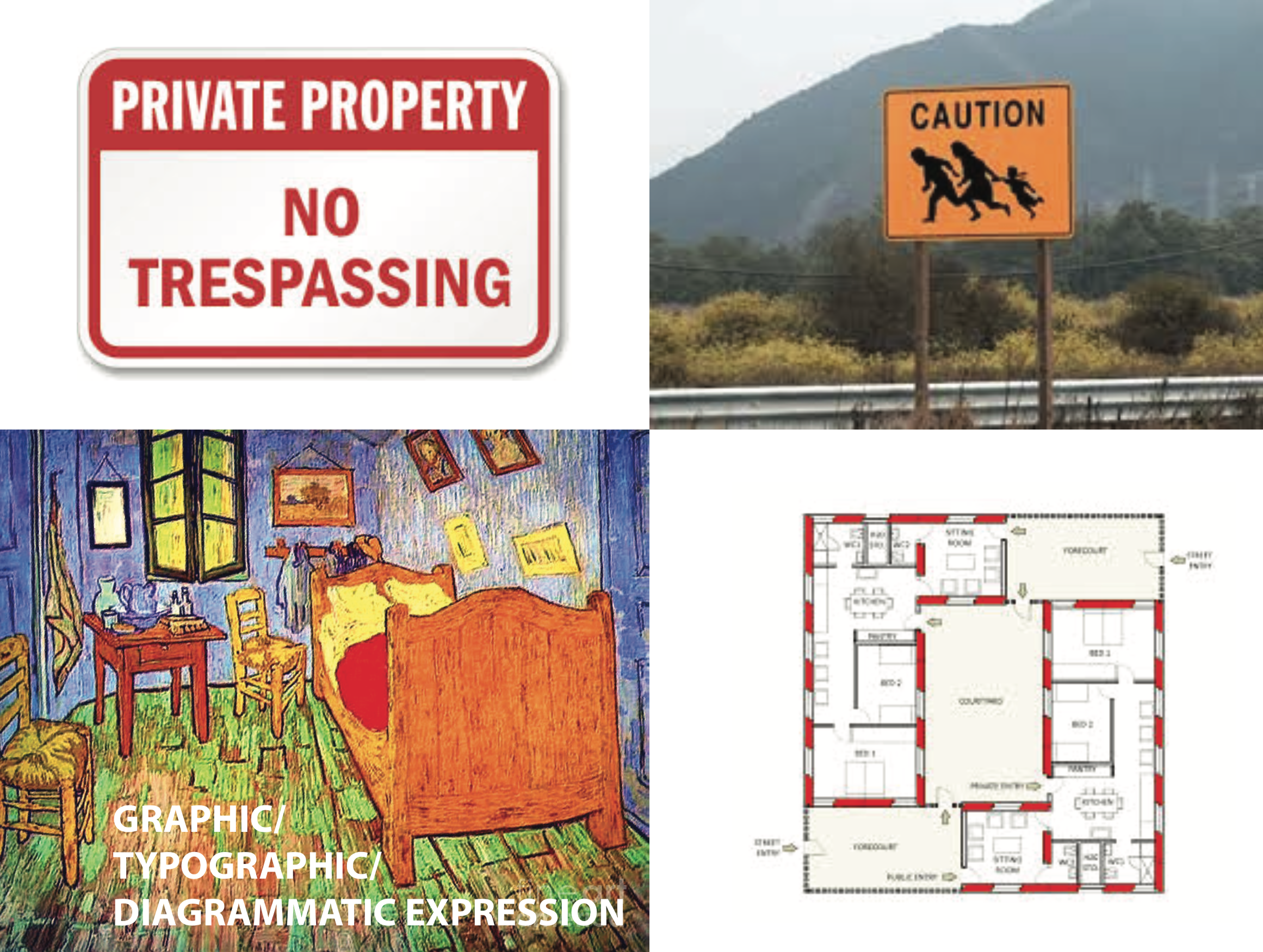
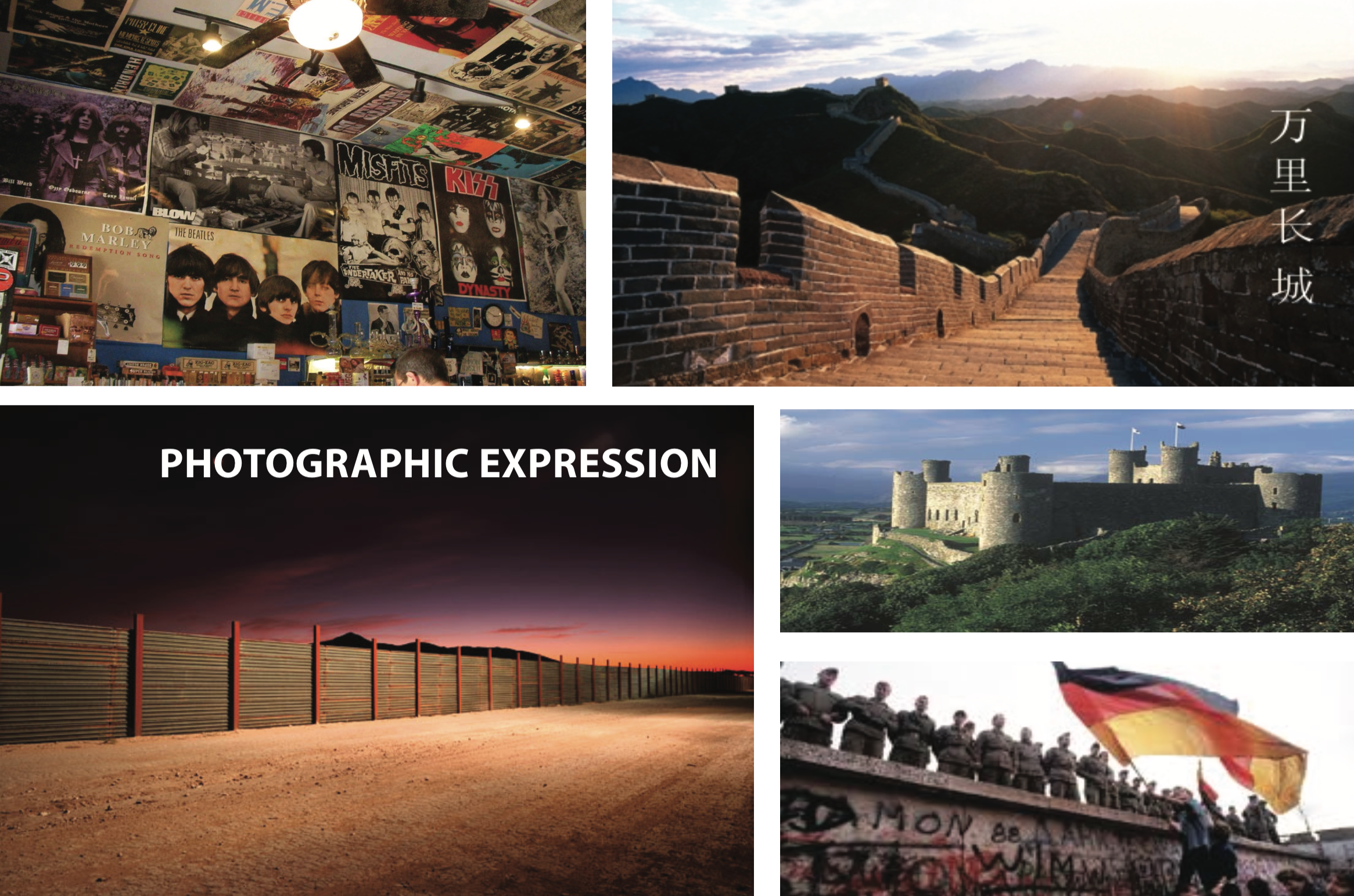
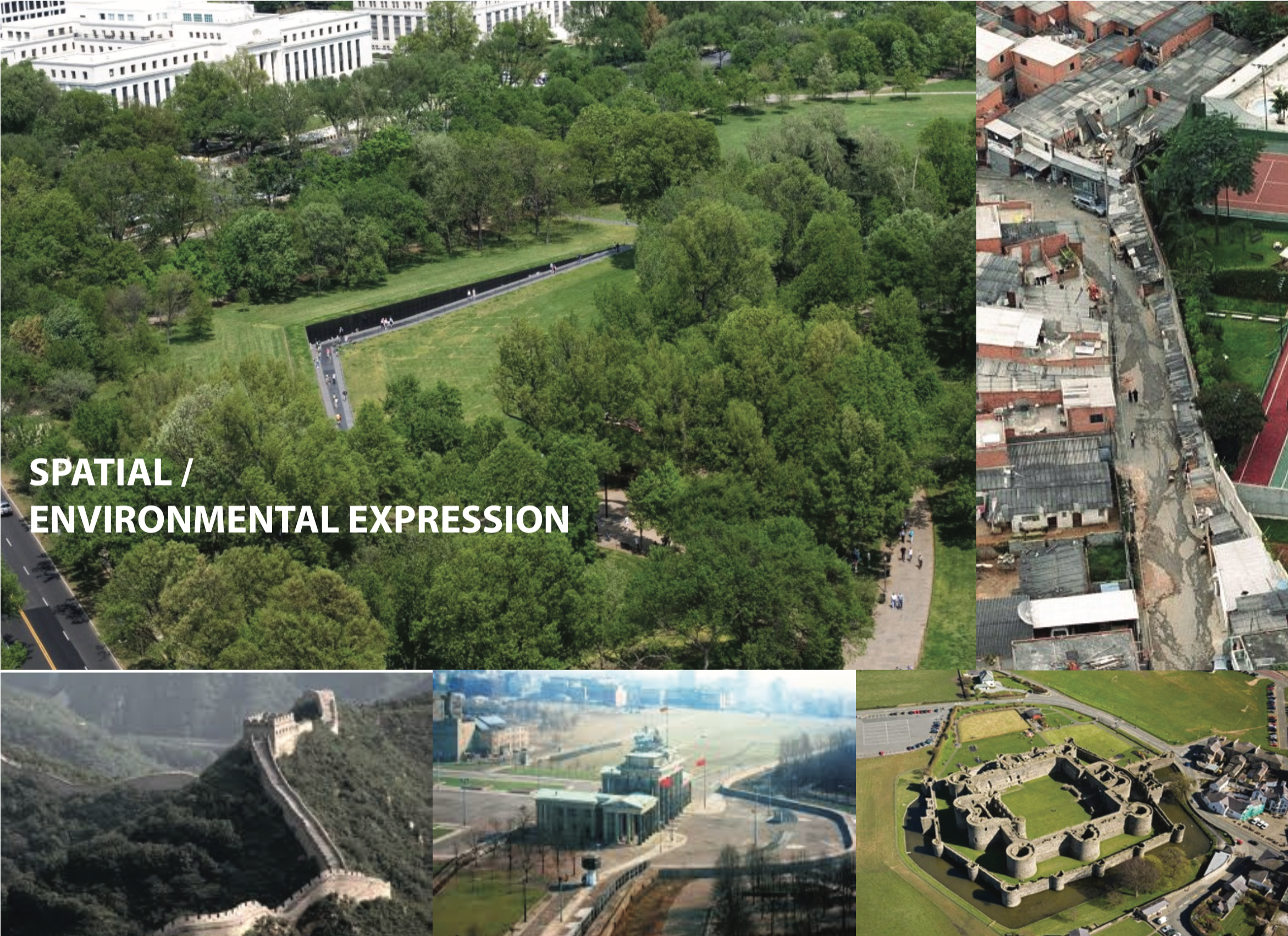
In order to represent the concepts of walls, I explored various ways the concept of wall could be expressed.
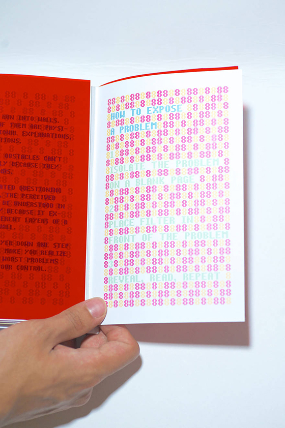
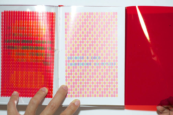
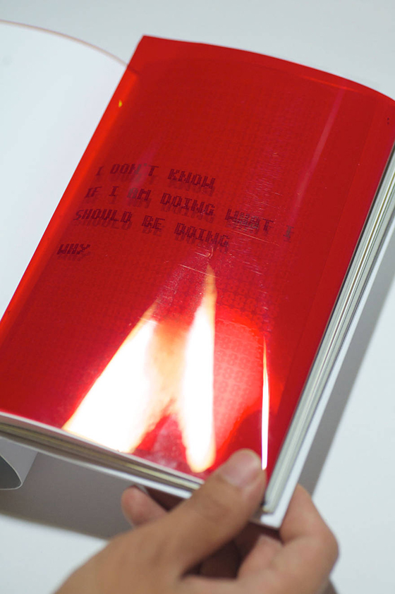
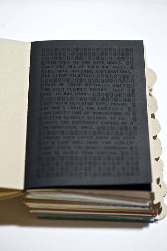
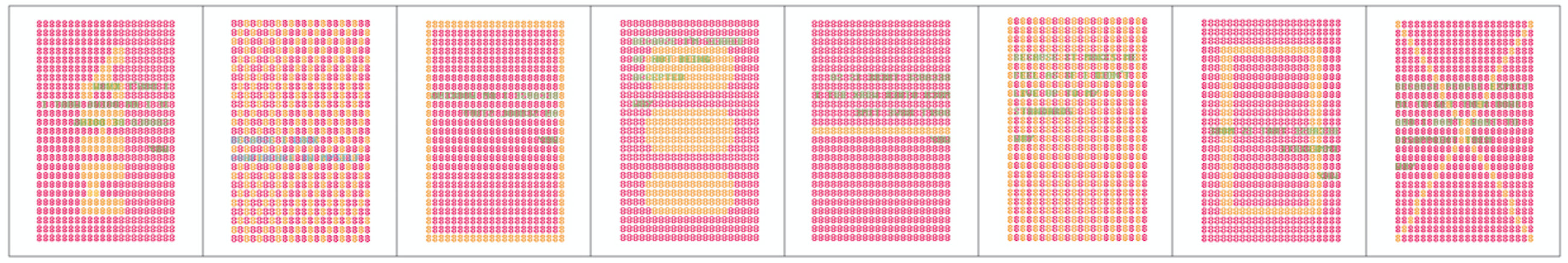
Every aspect of the interaction and aesthetics was designed around the idea of revealing the unseeable through different methods. I experimented with different ways to hide information onto the page and red reveal was the approach I ended up using.
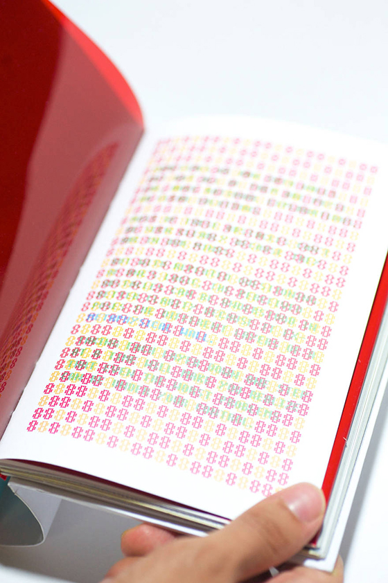
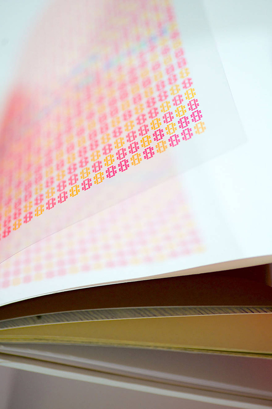
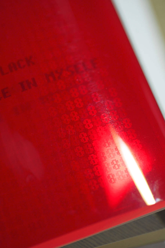
Another way the meaning of wall was expressed was through the background patterns of the page: Each page was filled with red pixelated 8s to mimic a red brick wall. Some patterns revealed a message in a large scale by spelling out "Why", while others were made to look like a cinder block or brick.

For the signature, each student was responsible for creating 2 copies of the special edition and 19 copies of the standard edition for the rest of the class, on top of designing the table of contents and the cover. The special edition utilizes a red reveal effect to show the content, with each page being printed on clear film. The standard version had black ink printed on black paper, and used the dark ink to create gradation and patterns.